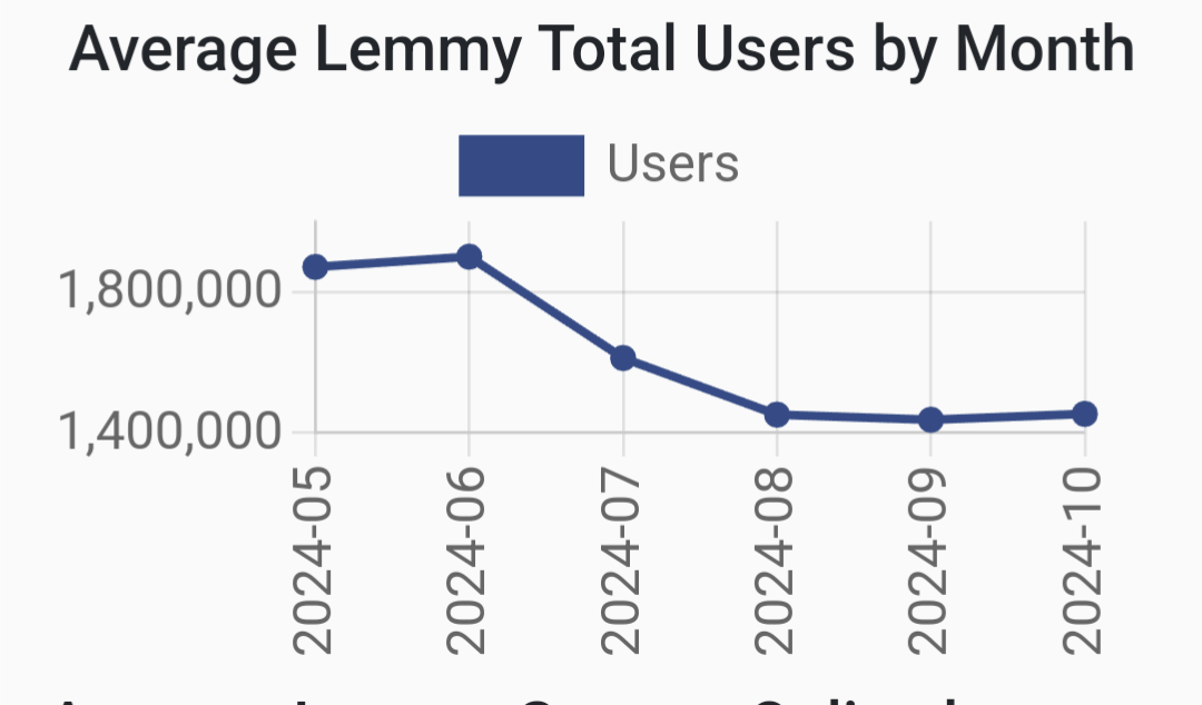
That graph is so misleading. Makes it look like almost all the users disappeared but the Y axis only covers a small range at the top.
The full range is about 5.5%. So while it is misleading, a 5% drop in a graph that consistent isn’t nothing. Something substantial absolutly changed
Maybe whole Instance that went offline.
That’s my guess to
It’s like 70k users.
Exactly. Not the over a million that it looks like at a glance.
The user count isn’t helpful anyway, active users is a much better measure.
true that
I captured the graph with the number after the decrease at the bottom right to try to show the number of lost users, but I see where you come from
Lies, damned lies and statistics.
no it’s not?
you can see the axes and op even mentions that it’s a 5% drop
the graph is clearly just fitted to the data
I edited the title after their comment, it wasn’t that clear at the beginning
In my classes on analytics, we were taught to prefer using normalised axes starting at 0 to more accurately put changes into perspective.
the graph is clearly just fitted to the data
That’s the problem. It’s heavily skewed when compared to the greater overall engagement statistics.
Did an instance go down?
Maybe it’s a problem with the crawler.
Probably but which instance has over 70,000 users?
not sure when entire fedi-reddit is like 50k AMU lol
Which one of you forgot to open the app so we all ceased to exist to save on simulation resources?
Go on… lol
At least user a log scale. But start at 0
Feel free to suggest this to the Fediverse Observer team
Ah, I didn’t know.
The monthly graph is pretty interesting in the same way, -400k?

Lots of farmbots going down looking at the servers graph
Interestingly the amount of active users status pretty solid at 200k indeed
Interestingly there seems to have been an uptick in comments.
Indeed, the plot thickens.
Maybe the farm bot owner decided to make all comments by a single bot now.
Curiouser and curiouser.
Probably some mundane explanation but still…
LOL
Was the metric measured before the day the was over which would limit the timeframe of the final day and show fewer users?
I dont see this chart when I click the linkIt should be there, it’s the second graph


