
In my country the checkbox must be for opt-in. And it must start off unchecked.


In my country the checkbox must be for opt-in. And it must start off unchecked.


When I hover over the pipedbot’s link it looks like it goes to piped. But yeah, misleading link text.


Somewhere between chaotic neutral & chaotic evil here.
One of a pair as portrait, the other as landscape; laptop left-aligned with landscape & base-aligned with portrait for an appropriately unholy trio.
I also use workspaces and screen sessions for maximal WTFery.
Not in Australia, but good suggestion in some other countries!
Nah it’s been years since I was charged fees for eftpos.
Paywave though, the vendors are getting shafted for that since it’s credit. So of course they’ll pass it on


I like lots of space, hence small icons.
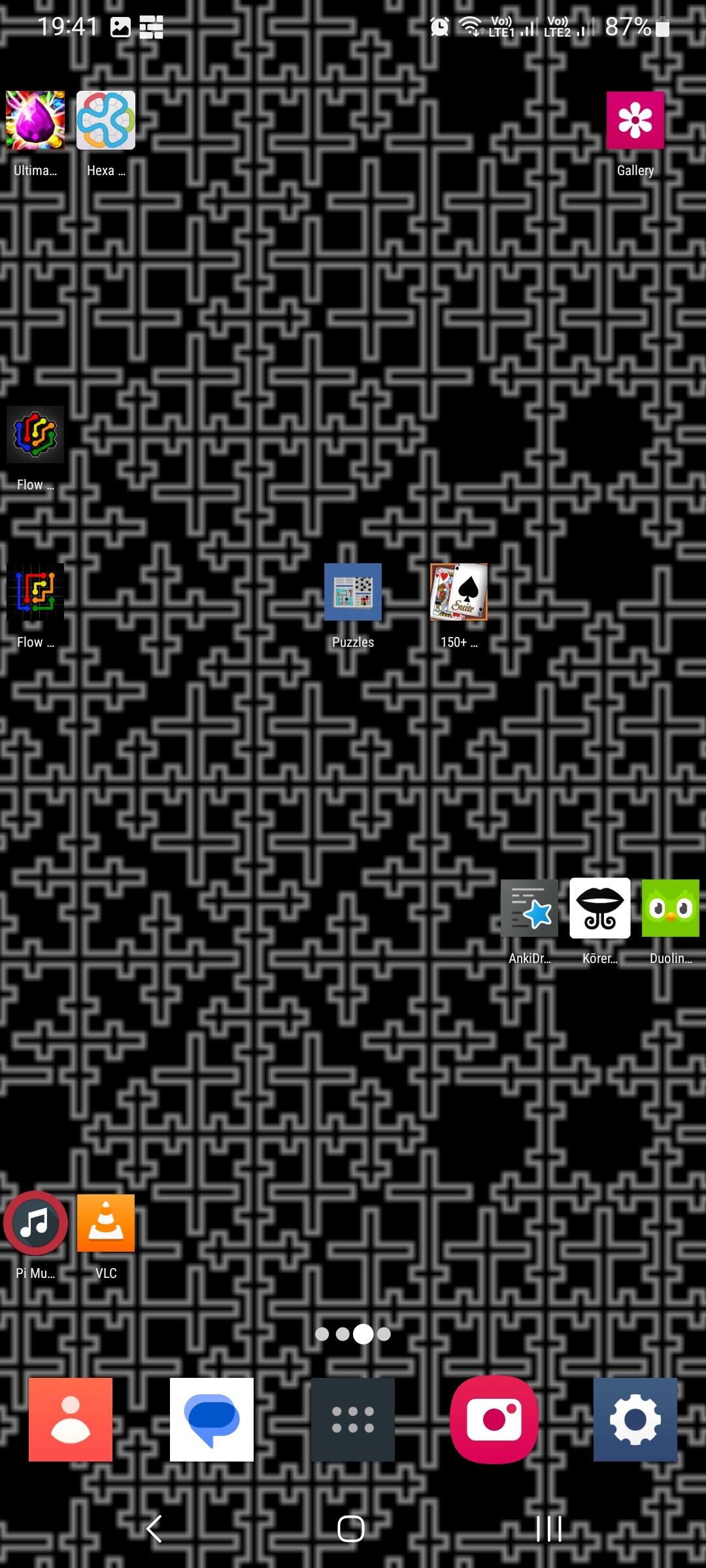
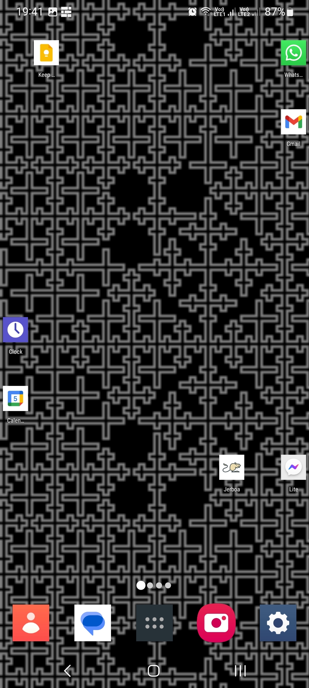
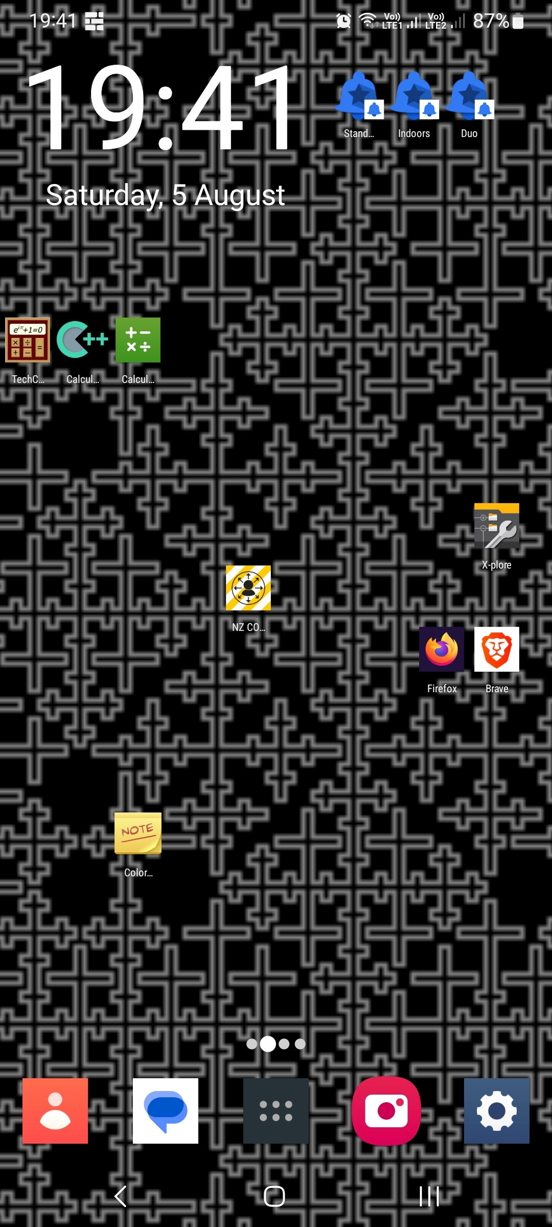
I like logical (to me) groupings in clearly defined and very separate areas. These features help me quickly find the app I want.


Rh screen with games

Lh screen with utils

Behind screen (if you think of it like a loop) with rarely-used things that I still want quick access to

I made the wallpaper.


Nova and some stock clock widget.

I’m studying a couple of languages that don’t have English as the native tongue. They provide no grammar notes.
The ones with native English do, but accessing it is not intuitive since you have to go to the Units view.