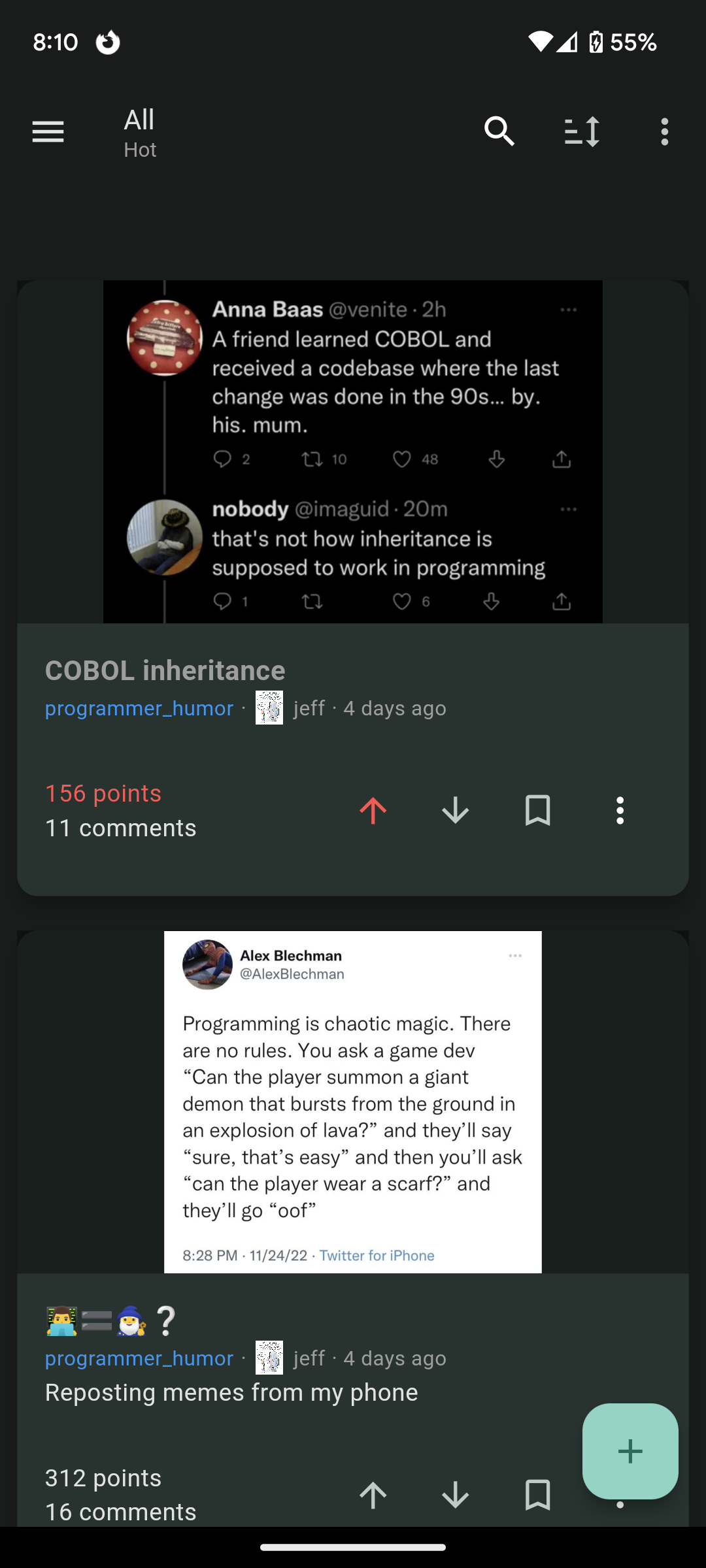
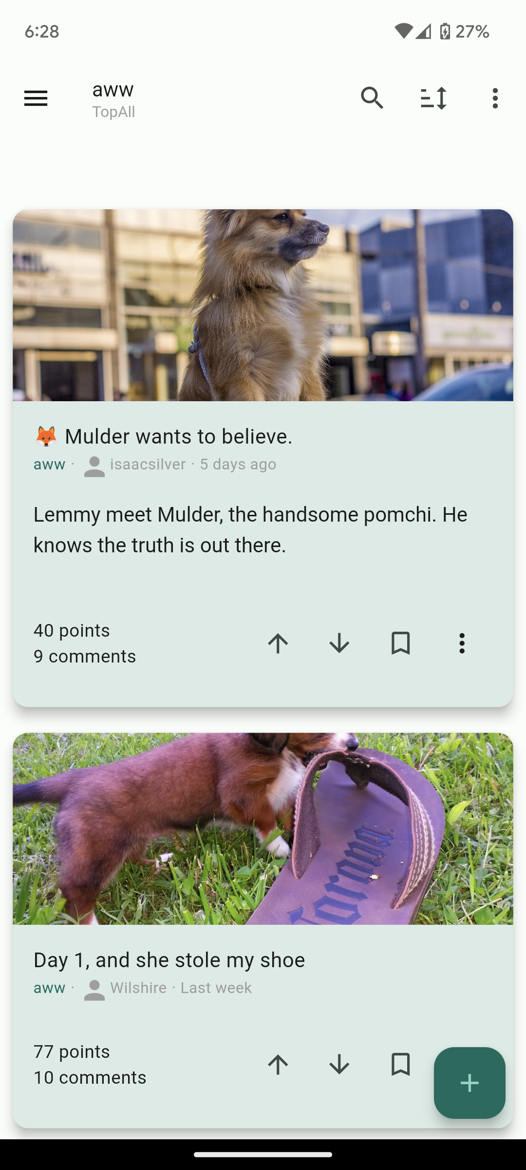
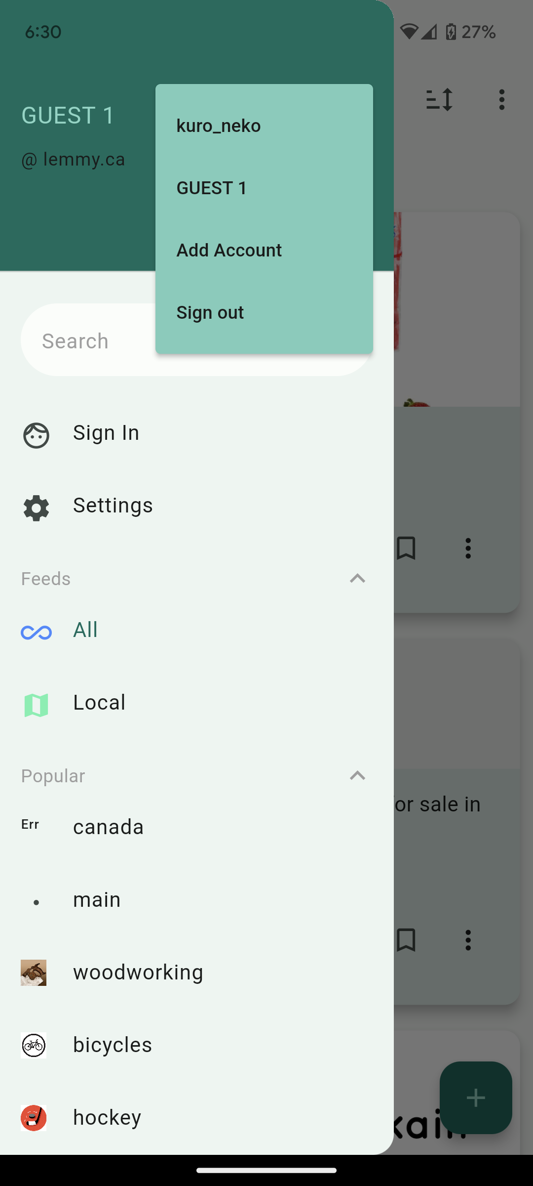
Hi lemmings, I switched over from Reddit 10 days ago now but I couldn’t find a mobile client that I was happy with with an experience similar to the Reddit experience I was used to. So I decided to build my own and I hope you will like it as well!
Play store link: https://play.google.com/store/apps/details?id=com.kuroneko.lemmy_connect
Features:
- Material U
- Dark and Light themes
- List view / Card view / Fullwidth view
- Filter lists for hiding posts
- Multiple accounts + switcher across multiple instances
- Guest accounts for viewing an instance without signup
- Search and community autofill
- Markdown support + attempt to navigate links correctly (/u/foo will open that user instead of browser kickout. Same for /c/, !, and @)
- Saving posts
- full sort types
- NSFW view options (hide, blur, show)
- copy text and url on all posts and comments
- add comments, replies, and new posts
- comment replies with line indicators
Here’s other screenshots:


Future plans:
- Improving the inbox
- Swipe actions
- Multi-~~reddit ~~communities
Thank you for taking a look. I hope others who are migrating from Reddit like me will find the app useful and I’d love to know your thoughts!
Edit: Community for the app is here: https://lemmy.ca/c/lemmyconnect
The app looks great! Feels very fluid.
I have only three requests:
- make it FOSS in spirit of the fediverse (obviously you don’t have to, that’s your choice)
- give me a way to download pics from inside the app. I very often download memes and share them in other chats. You’ve got open external, which works, but it’s an extra step. Downloading in app would just be more convenient.
- lastly, give me a way to buy you a beer 😁
Hi, thanks for the feedback and I’m glad you’re enjoying it! I’ve added a download button to media views. Open source is on the roadmap as well if there’s enough interest.
Holy crap. That’s awesome! Thanks!
Hey, black cat! From the screenshots, your app looks very promising. Would you consider making it FOSS, though? Just asking.
I am also looking forward to having access to the source code!
I would strongly recommend open-sourcing it! There are several FOSS apps already and it would be hard to compete against them without opening up =]
Thank God there’s a filter setting 😭😭😭 sorely missed coming from infinity. First thing filtered? “reddit.”
Nice job. But not available in my country (Germany). Looks really nice and familiar to reddit apps.
Just added Germany to the list of countries! I think it will take Google an hour or so to update.
Thanks!! Would be nice if you can setup the f-droid app.
Hab sie gerade installiert. Probier’s noch einmal ;)
Congrats for the release! I finally have alternative to Jerboa!
Some feedback if you don’t mind:
- Full Height view. It’s like the full width view, but display the image without any cropping.
- Tap and hold to show image in full screen, release to close. Very useful for compact views. Also should works for articles thumbnails.
- Native imgur support. Right now it’s treated as a web page. If it’ll require using paid API, just disregard this until you have some funding.
- Preload images when on wifi (optional setting). Basically preload the next N images in the list so they’ll appear instantly.
- Show full community names and user name. Right now it only show the community name and user name, but not the instance name. This is confusing if you subscribed to multiple communities with the same name from multiple instances. Same for usernames.
- option to toggle denser comments views with minimal whitespace.
- (possible bug?) The community list on the side menu doesn’t show all my subscribed communities.
These are very good suggestions! would also like for it to show the instance name of a post as well as the hold-to-show-image
I love the look and layout, but I can’t get any threads to load. It just says “No posts”
I’ll take a look! Do you have any filters applied? Is that across all instances?
Can you also host the APK or upload it on F-Droid?
Yeah I’ll look into uploading the APK and add a reply here when it’s ready.
Thanks, open source/foss is even better but thanks for at least looking at distributing it on other platforms!
I think I will open source it in the future but right now it’s a very messy codebase coming from essentially a long coding binge.
A lot of people think that way but don’t be afraid to post code because it isn’t perfect. Lots of enterprise software looks awful. Also anyone who wants to be an ass about your code for such an early release isn’t worth listening too. Most are just happy to help and can do pull requests to make your project better.
Agreed. I’ve seen some horrors in corporate code bases in my time. Created some, even. 😁
It’s interesting. Needs some more formatting options imo. I liked how in boost for reddit the titles of posts were always at least as big as the preview of the body of the post. Just makes it look much cleaner imo. Could use a font size option. Could use some color options too eventually.
Also, it needs a “Subscribed” page. Default lemmy has this page that only shows you content from communities youre subscribed to. You should see about getting that feed on your app.
Overall though great work, it looks really promising thus far and I’m impressed with how quickly you’ve put this together.
I’ll take a look at how Boost for Reddit formats their titles, thanks! The ‘Frontpage’ once you’re signed in should be equivalent to the Subscribed page.
Just adding a +1 for Boost’s formatting!
‘Subscribed’ is called ‘Frontpage’ in the app, you can find it in the sidebar. Edit - oops, looks like kuro_neko beat me!
That UI looks really clean. I love it. Is it open source? Not that i dont trust you but i try to not use any closed source apps anymore, i would appreciate it if you would share the link to the source code.
I signed into my dataterm.digital account but when I go on profile I see my feddit.de profile even though I didn’t login with it.
Ah I must not be filtering the username with the instance so it’s grabbing the first username match it sees. I’ll fix this in the next release :)
I love the app! I just wanted to give you some debug info. I can’t log into a second account on my current andoid tablet or andoid 10 phone. The button to do so does nothing.
Hi! could you confirm you’re on the latest version? it should say 1.0.31 under settings
That fixed it! You and your team are working very fast! Keep up the good work! It is appreciated!
That fixed it! You and your team are doing great work! It is appreciated!
That fixed it! You and your team are working very fast! Keep up the good work! It is appreciated!
Looks good and I was able to get it on pretty quickly. I was about to post this from the app but saw it’s missing the web’s markdown shortcuts and image upload option.
Also looking at this post the screenshots are cropped and I didn’t see a straight forward way of looking at the whole image.

Thanks! I’ll make a note to add markdown shortcuts and image upload to the next release. I should probably make those cropped images expand out on click.
Also thinking long press option to download/share images as well for proper meme redistribution.
And I forgot to say on my first message, thank you for taking the time in developing this, this type of work is often thankless and I appreciate it.>
Looks great from the screenshot!
The Google Play doesn’t let me install it though and I can’t find it via the Google Play app.
Edit: it says that the app is not available for any of my devices. I’m using a Pixel 7
Strange - I’ll take a look! I’m testing on a Pixel 6 so I would think it would work.
I’m on pixel 6 and it doesn’t work with logged in aurora store.
Edit: it works now!
just downloaded the app. I really like it. please keep up the good work
Thank you! I’m glad you’re enjoying it!


