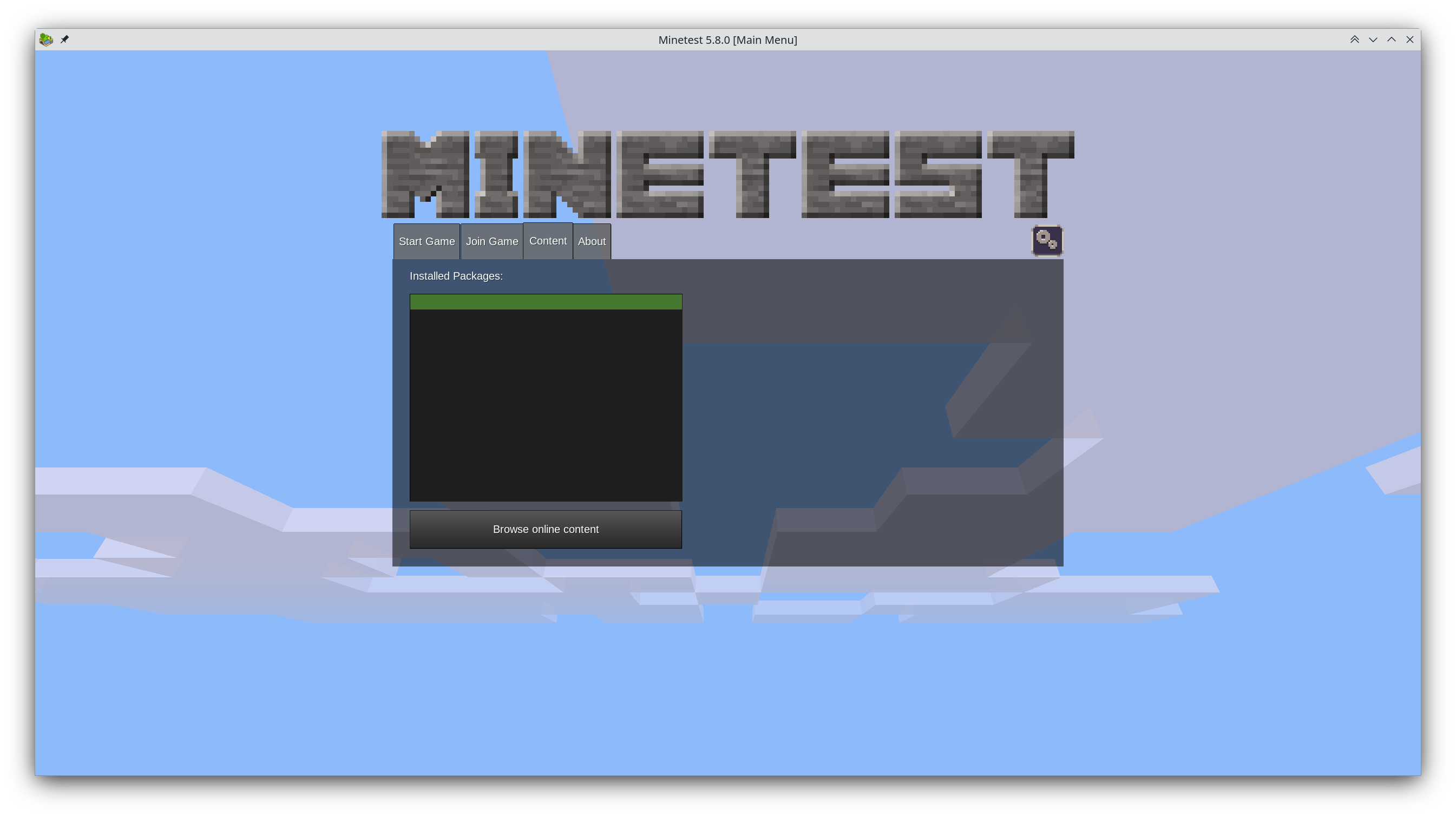
Years have gone by and hundreds of comments have been written about the proposal, but the main screen still looks like this:

What do you guys think is the cause of this stagnation? Too much discussion? Too few people willing to fork it?
I’ve thought about it myself and why I didn’t contribute a new main menu and came to the following conclusion: It requires understanding Minetest’s codebase and the libraries it uses, it requires C++ experience (which I don’t have), and after all that effort there’s zero guarantee that it ever gets used.


I think it’s just a larger undertaking. Like mentioned in the last comments. People either need to address that as the main focus for some new major release and work on it. Or subdivide it and find people to work on the individual components to make it happen (gradually).
Also there is always the thing with hobby / free software projects. Sometimes people focus on functionality and features and not so much on asthetics and the first impression. I agree the welcome screen is somewhat important as it’s the first thing a new player sees. But I also like the developers to work on features which enhance the actual gameplay because I just see that screen for 10 seconds and it’s kind of a waste of time to improve it for someone like me. The current screen works alright. There are several dynamics affecting projects: “Perfect is the enemy of good” (don’t make it too complicated) but also sometimes a makeshift solution or something that works “okay” stays inplace indefinitely because “it works” and people concentrate on other stuff. That’s just how things work. It takes deliberate effort to work against those dynamics.
So I’d say the cause is, their focus is somewhere else.