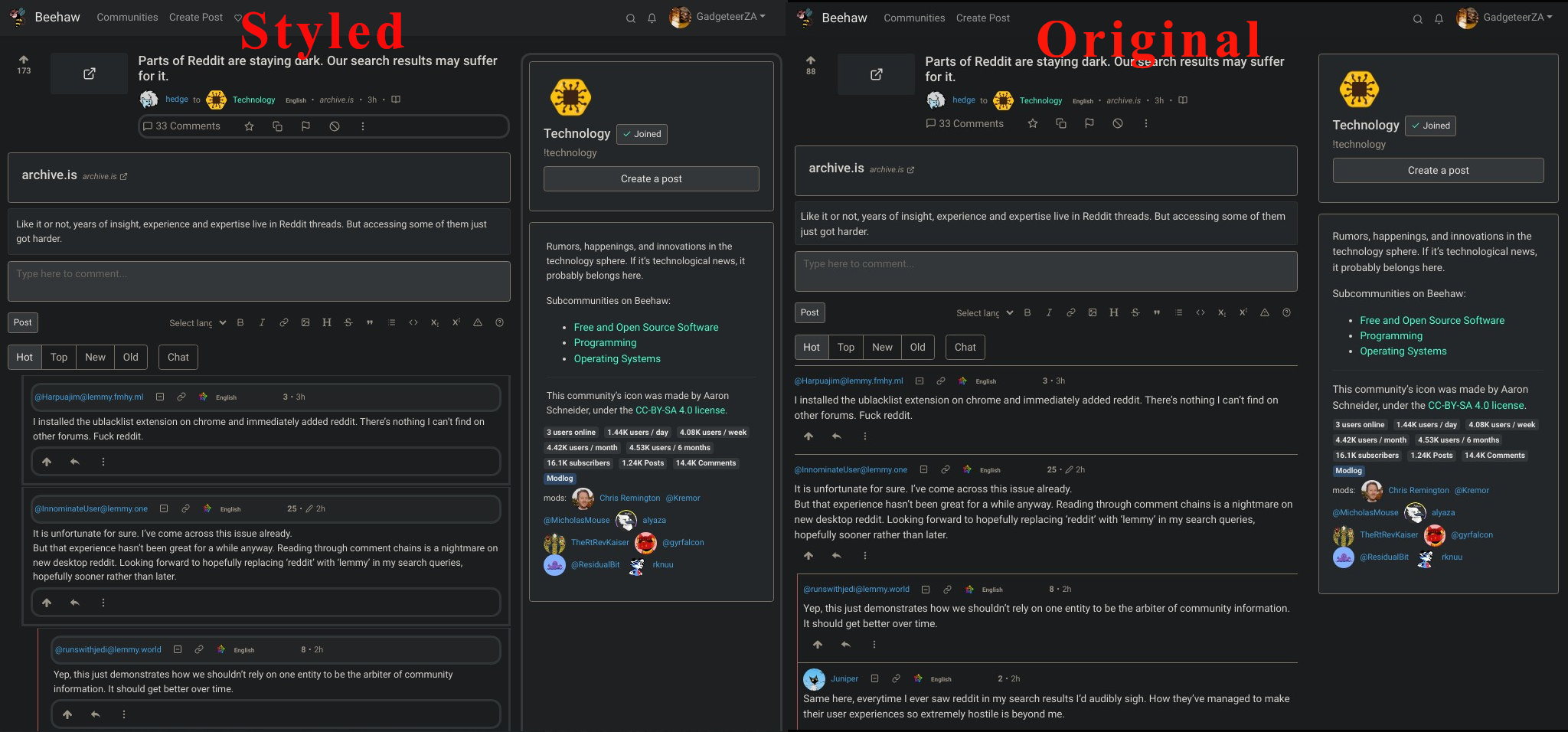
For anyone that would love to get a little more separation/readability out of comments, download Stylebot for chrome or a custom CSS extension for your browser, then use the CSS I wrote out below to get it to look like my screenshot!
Edit: Been making periodic updates throughout the day, and it’s sooo much better now, make sure to use the update code below!
/* ==UserStyle==
@name           LES
@namespace      github.com/openstyles/stylus
@version        1.0.0
@description    A style based on the visuals of RES
@author         Sascha Englert
==/UserStyle== */

@-moz-document domain("feddit.de") {
    div.comment {
        border: 1px solid #ced4da !important;

        border-radius: .5rem;
        margin: 10px 0;

    }

    div.comment-node {
        border: none !important;
    }

    div.details {
        padding: 0 !important;
    }

    div.d-flex {
        justify-content: unset !important;
    }

    button.btn {
        padding: 0 10px;
    }

    div.mb-3 {
        margin: 10px 0;
    }

    svg.icon.mini-overlay {
        color: #f2f2f2;
        background: #ced4da;
    }
}

div.details.comment-node.py-2.border-top.border-light {
  border-style: solid;
  border-color: #ffffff;
  padding:  10px;
  margin-bottom: 2px;
  background-color: #fafafa;
}

div.d-flex.flex-wrap.align-items-center.text-muted.small {
  border-color: #fafafa;
  background-color: #eeeeee;
  border-style: solid;
  padding:  3px;
  border-radius: .9rem;
}

div.d-none.d-md-block.col-md-4 {
  border-style: solid;
  border-color: #eeeeee;
  background-color: #f5f5f5;
   padding:  9px;
   border-radius: .9rem;
}

div.d-flex.justify-content-between.justify-content-lg-start.flex-wrap.text-muted.font-weight-bold {
  background-color: #fafafa;
  border-color: #fff;
  border-style: solid;
  border-radius: .9rem;
}

div.d-flex.justify-content-start.flex-wrap.text-muted.font-weight-bold.mb-1 {
  border-style: solid;
  border-color: #f5f5f5;
     padding:  2px;
   border-radius: .9rem;
}

nav.navbar.navbar-expand-md.navbar-light.shadow-sm.p-0.px-3 {
  background-color: #eeeeee;
  border-color: #fafafa;
  border-style: none;
}

div.md-div {
   padding:  4px;
}

div div p {
  font-size: 14px;
}

div.comments {
  padding-left: 20px;
  padding-bottom:  5px;
}
Side-by-Side screenshot comparison for those who wonder what it looks like…

heads up you can use the code block to make this more readable. In markdown it’s a block like started ended with the triple “```”
Maybe worth looking at making some of these changes on the github project for lemmy, since it is open source. Idk how open they are to styling changes at the moment, but seems to me it would be worth while for some like community style picker to be build out, and people can just select the theme they like the most.
Actually looking at it more it looks like they already have CSS themes in a folder there.
You might want to consider putting this into a gist so it has a static link and is easily installable/can see changes
Or just publish to userstyles.world through stylus.
Either way, thanks for sharing.


