Everyone is posting android so here you go.
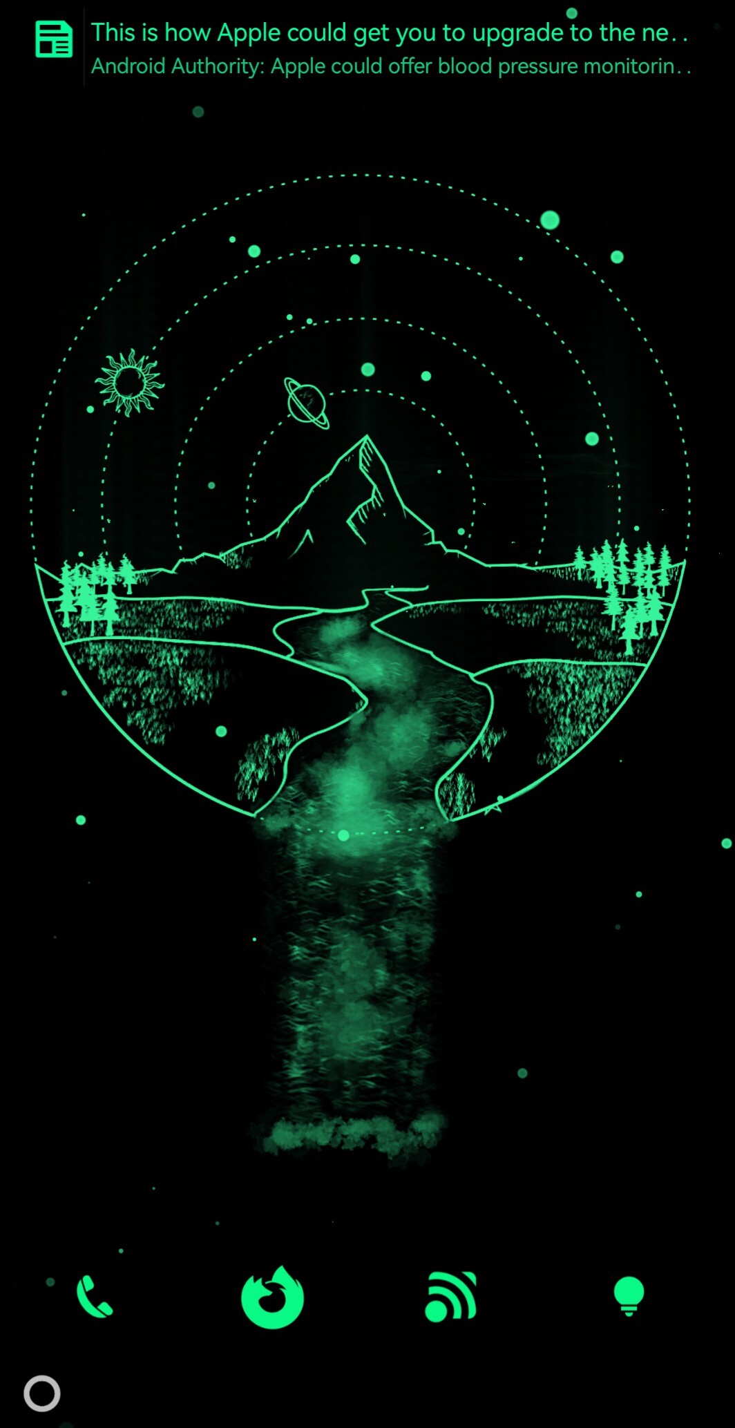
This is my super minimal setup, it’s convenient quick to use and I have no issues with it.
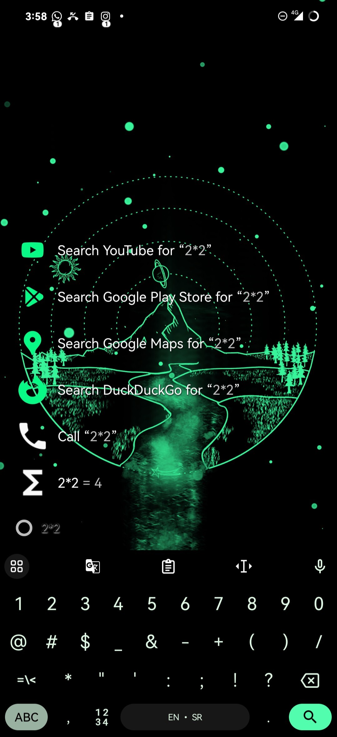
I love Niagara, even paid for lifetime. I switched to Kvaesitso a while back, its open source and feels a bit better to navigate imo

This one is actually pretty solid! Thanks for the recommendation.
Kvaesitso is my all-time favorite android launcher, and I’ve tried pretty much every major option
I tried both (and a bunch of other options) when Nova broke from an update. They were my two favorites, but ultimately I found I prefer Niagara’s navigation I think.
I find it gets cluttered with too many apps. After like 40 apps Niagara can become a bit long to scroll through, especially when i can’t remember an apps names half the time lol
Remembering app names is a must. Generally jumping straight to the right letter will let me open the right app with one click, it’s only my “S” named apps that have enough apps to require additional any notable scrolling after jumping to the letter (I have 24 apps starting with S, and my screen only shows 15 apps max at once in the Niagara app list).
For all my most used apps, I put them in folders on the Niagara home screen for quick access. I also do this for apps like games where I want to view multiple options at once to decide between them. Anything I’m not accessing often needs some searching to find anyways.
That’s why Niagara introduced pop-up folders a while back.
I access about 80% of my daily apps through these instead of scrolling down the entire list.
I might have to check this out. I’m not sure how I feel about it being search based. But I do like the GPL license and it looks like it operates smoothly.
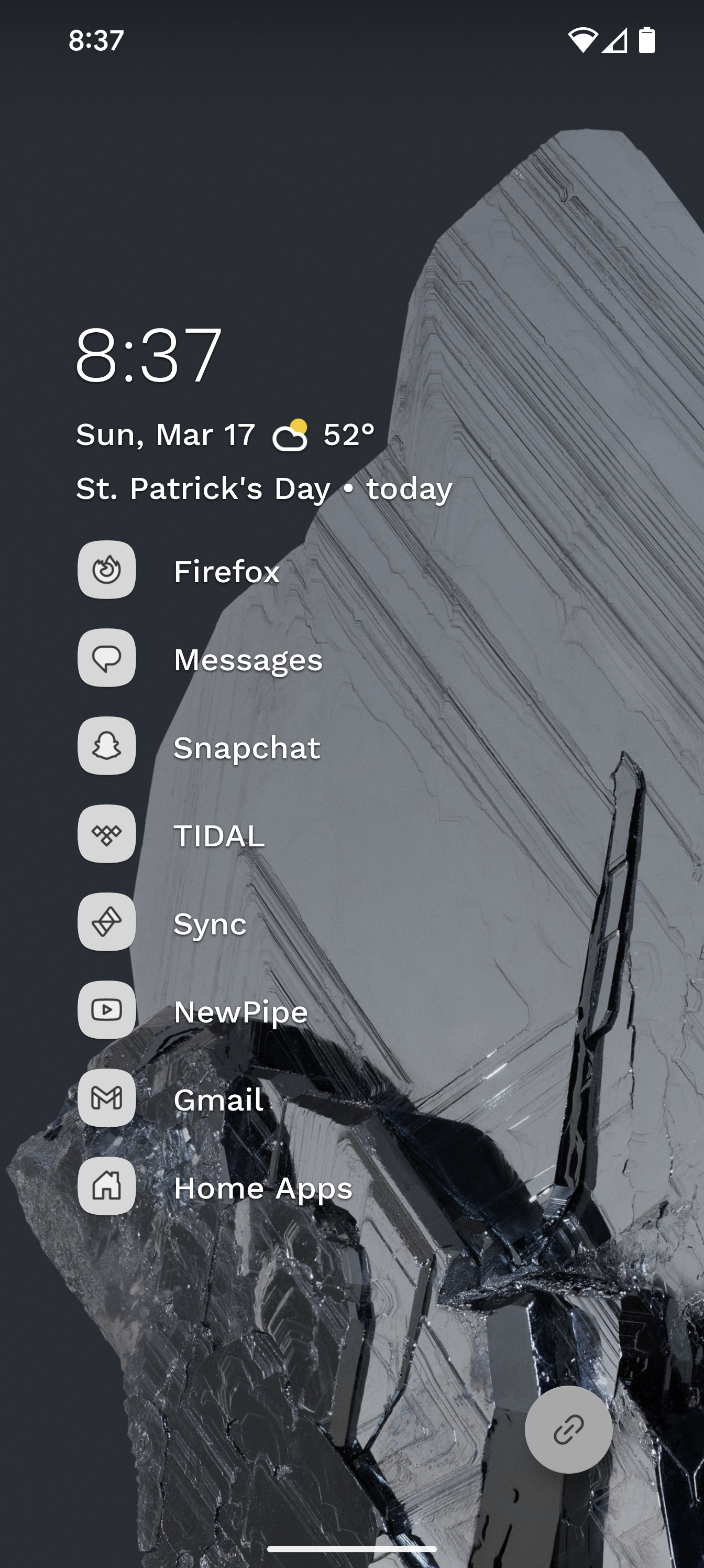
Absolutely love Niagara. The most used shortcut is the Niagara button. A swipe up to get a new Firefox tab and I can do searches without having to interact with Google’s apps
Sorry,I am a bit confused by you mention of a Niagara button - what and where is this?
Love the home screen!
It’s the floating action button in the bottom right. You can enable it in settings, and have a tap on it or swipe on it bound to two different apps or shortcuts. A shortcut I use it for is to open a new web browser tab to do searches.
I use ff as well and love that idea! Neat, thank you!
Update: me gusta
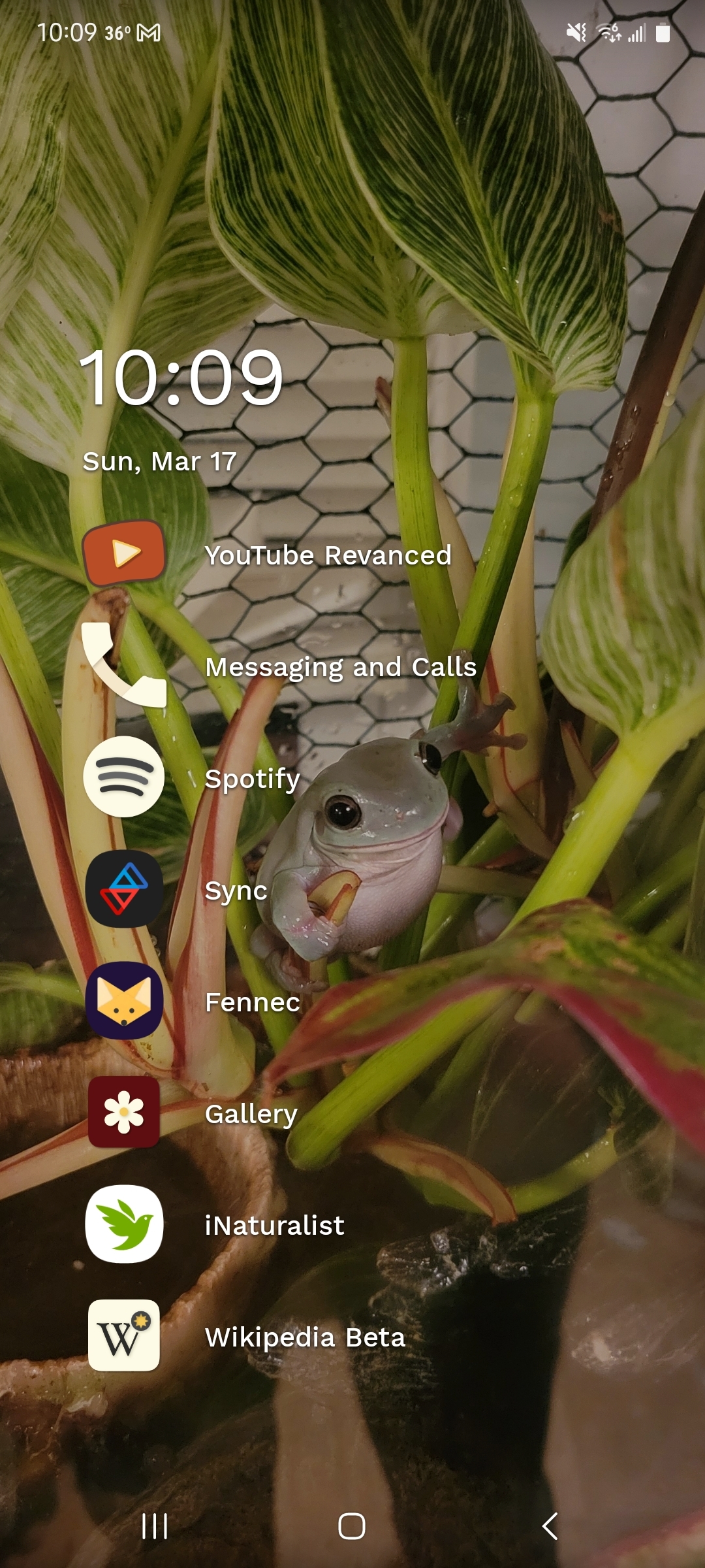
Another Niagara user! I have my Mastodon, Pixelfed, and Connect apps in a folder with that share icon. The icons are from a set called Flight.
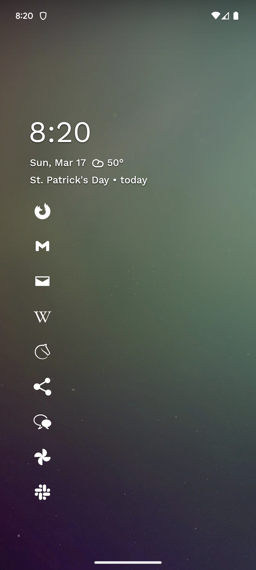
Me too me too

That wallpaper is beautiful
This is built in wallpaper in Niagara, in anime section
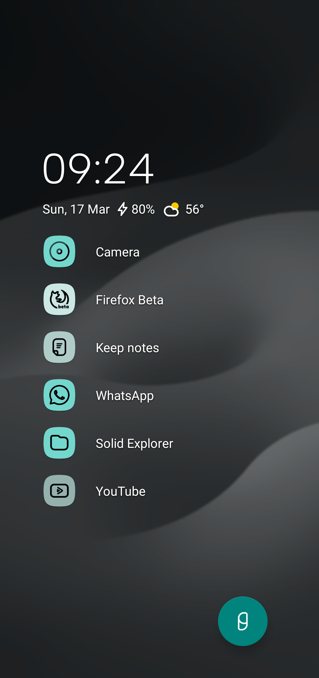
With Pixel Material You icons.
I’ve had Niagara launcher as my daily driver for over 2 years… LOVE IT
also love people’s confused face when they see my phone, not knowing “what I did to it now” hahahaha
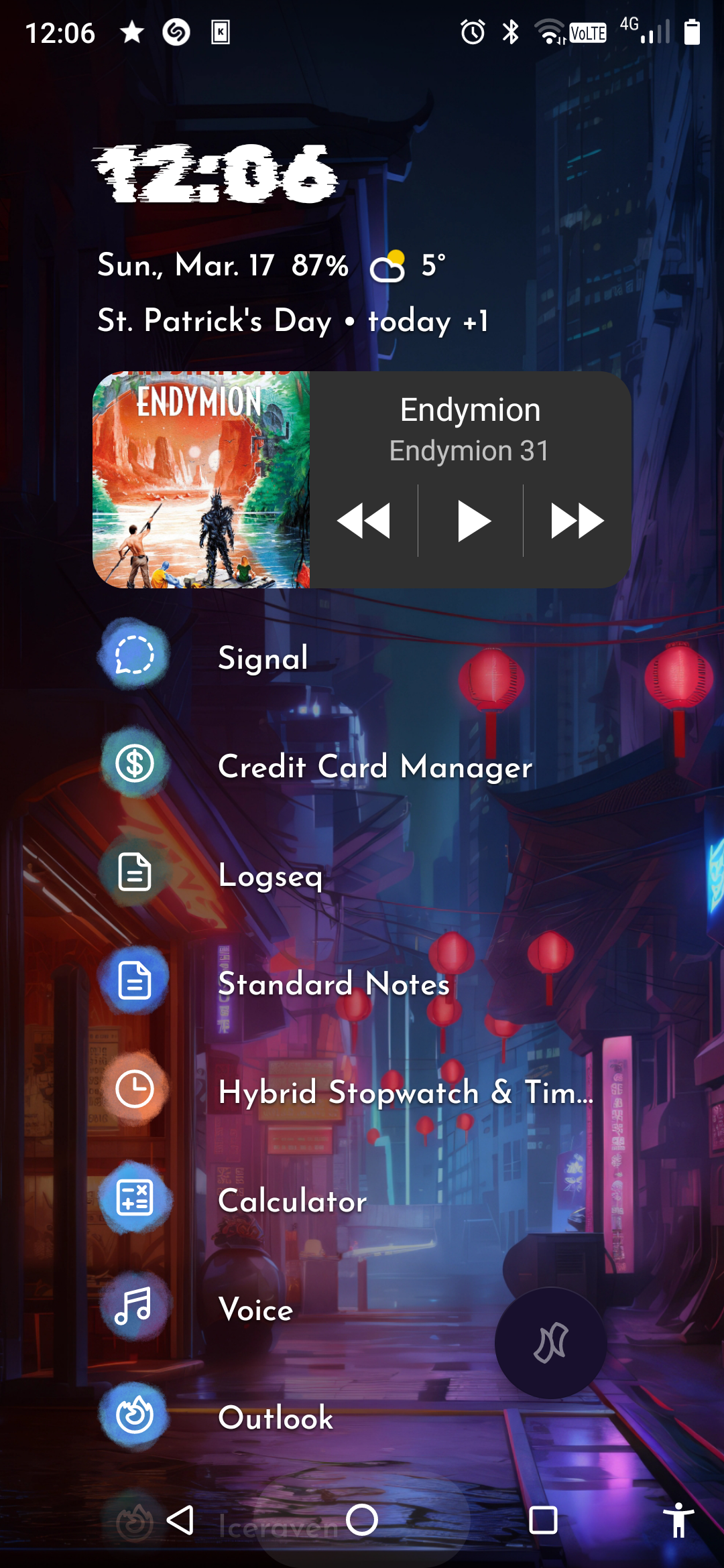
 Love Niagra
Niagara is the goat!!
Niagara launcher is the best.

Same

Is this launcher suitable for E-Ink devices? If not, has anyone a recommendation (preferably similiar). I currently use mlauncher but it has no icons.
I personally haven’t tried it on an e ink device. You’d have to check, it’s free with paid add ons so you can test it.
Great thread - might make my icons a little smaller but I have a big phone (for my hand) so I tried to balance minimalist with color-immediacy

Launcher: kvaesitso
Icons: crayon
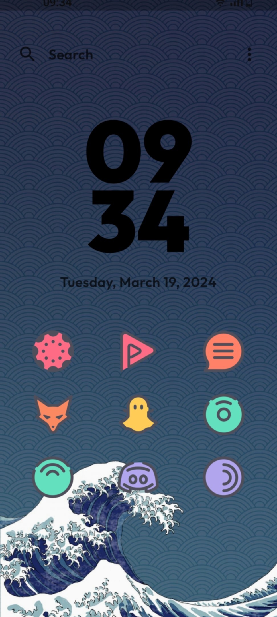

Background from u/chazcurtis on reddit

I’m a fan of KISS launcher coupled together with Wallpaper engine. It’s damn simple and it’s only a swipe up to use the keyboard. Not to mention you can directly type in links, contacts, w/e and it just opens them! Highly recommended.
deleted by creator
Recently switched from niagara to kvaesitso. Its a nice change of pace

